beach brews
crack the coast open.
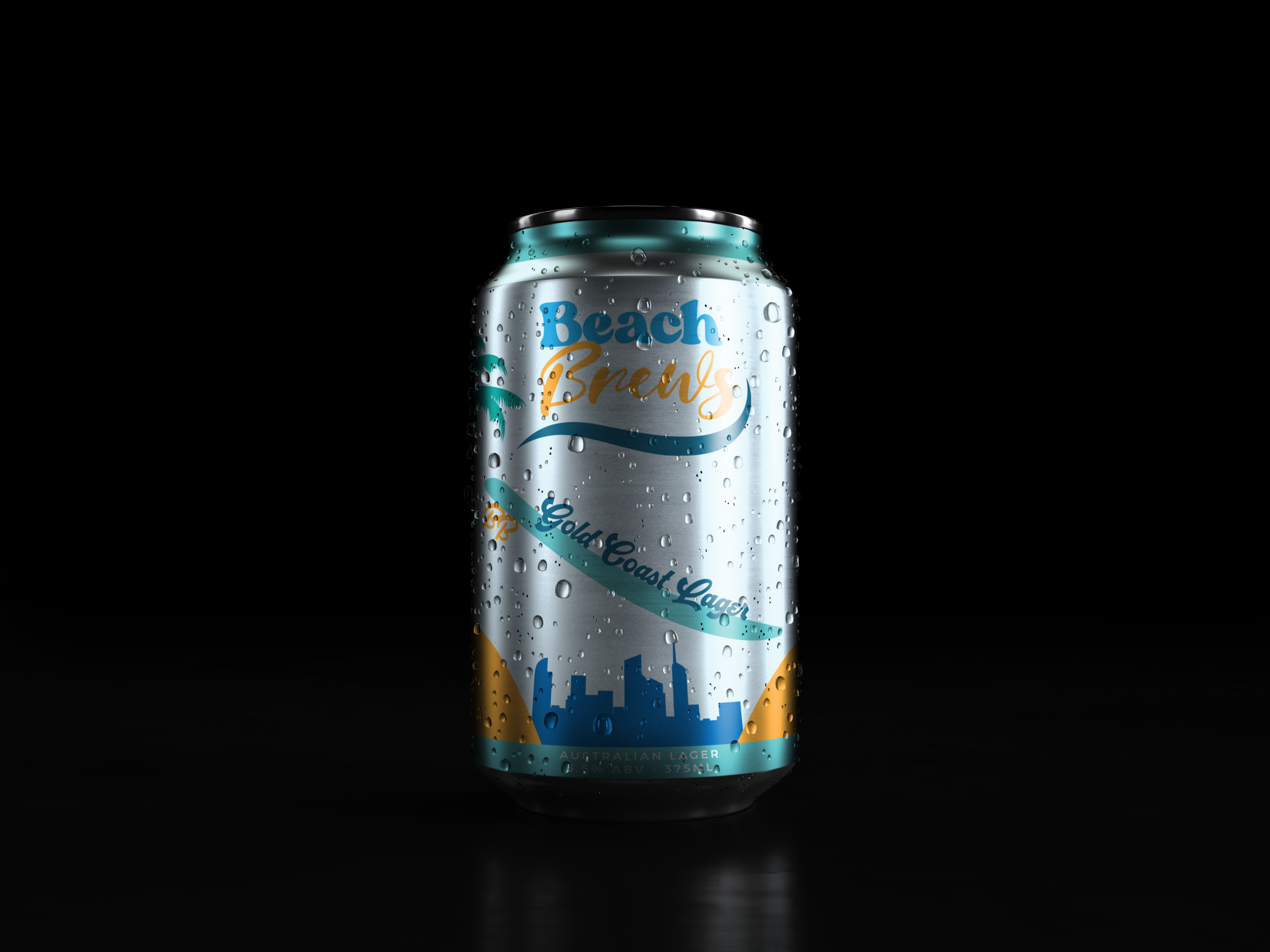
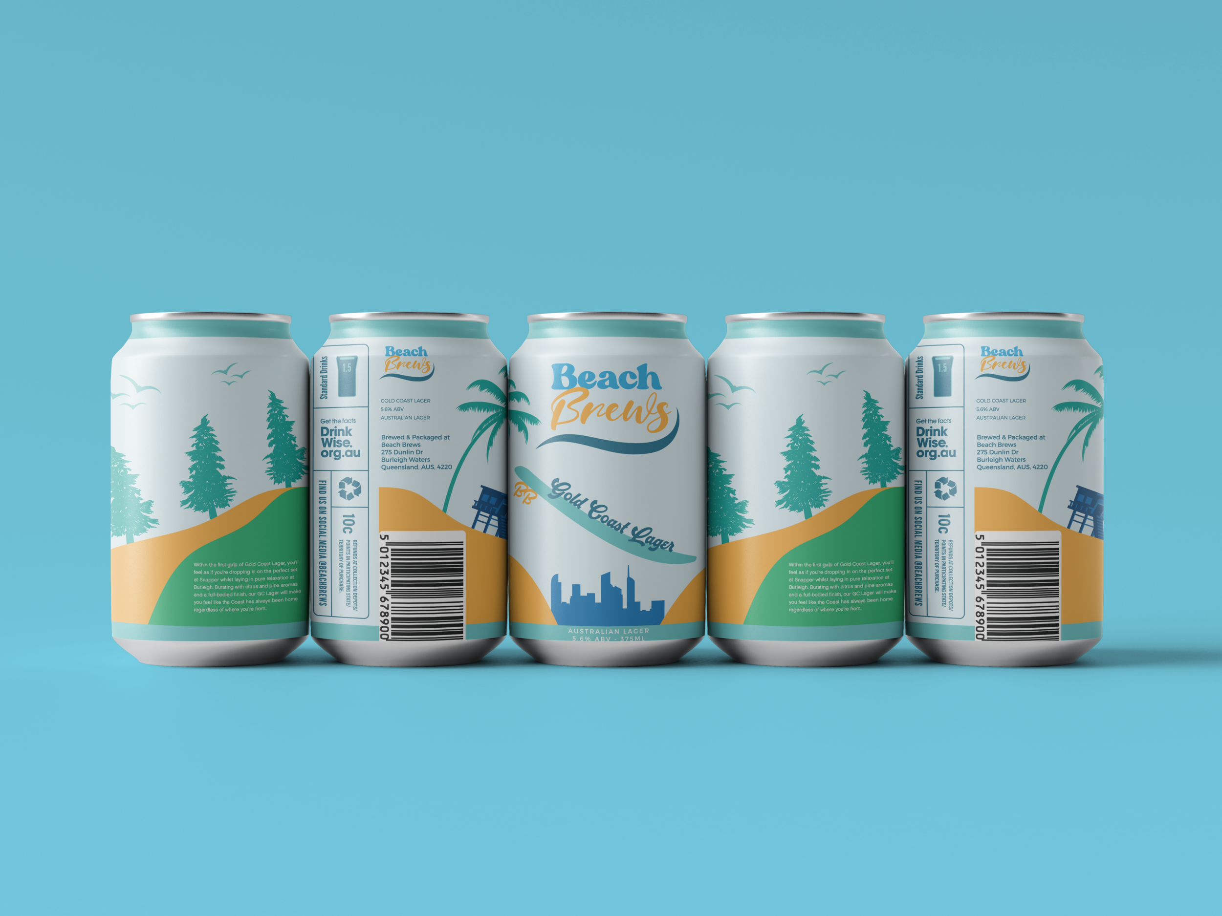
What an absolute ripper of a project this was. The task was to create the first member of a new family of beer aiming to breach the market, in which each beer would be representative of a well-known beach town within the country. For its inaugural offering, Beach Brews was after not only the logo for the brand itself, but also a packaging design for their new Gold Coast Lager.
Work hard, kick back.
The logo of Beach Brews didn’t start off as the design featured on the can. Prior to what’s shown, I’d experimented with a logo that focused a lot harder on visually encompassing the laidback nature of the Coast, and what better way to do so than chucking up a shaka. Beach Brews also wanted their logo to be designed with the notion in mind that it will be used on collateral outside of cans such as clothing and other merchandise, so mockups were created on shirts for them to show the vibes of this initial aesthetic. I moved away from this design though after experimenting with less, and being able to turn it into more.
beers & bants.
With a combination of slab and cursive fonts that harken back to the sandy feels of the 70s & 80s on the Coast, the new simple and clean logo for Beach Brews was decided upon. This meant I could now whip up the design for the Gold Coast Lager can. Having grown up on the Coast myself, I wanted to infuse the can with scenery that I and countless others would immediately associate with our home suburbs. For the case of Beach Brews, it meant fusing locales such as Burleigh and Coolangatta together to create an instant sense of immersion into the lifestyle we have here.
rip in.
It’s one thing to draw the areas of the Coast that we know so well, but it’s something else entirely to create a design that allows whoever is cracking one open to legitimately feel like they’re drinking these beers in those areas regardless of where they are, with the feeling of being surrounded by good vibes and great mates. Rip in, champions.


