CHENJIN
Chén jìn - to immerse. For the creation of a modern typeface that not only paid homage to the ancient art form of Chinese calligraphy, but also emanated the pure tranquility I experienced throughout my own travels in China, immersion is exactly what I needed to achieve.
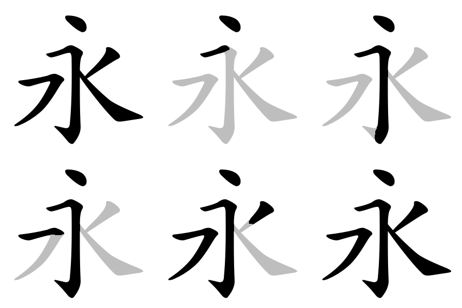
The Eight Principles of Yong were the foundation on which Chenjin was constructed, as these rules dictated the all of the most common practices of script using just the one character, such as stroke order and direction.
I carried this notion into Chenjin by designing the characters of its alphabet in a way that included its own specific guidelines inspired by the aforementioned principles, as this would allow me to maintain a much higher level of consistency throughout the aesthetic of my typeface.
Brushed off.
In order to continue with the level of authenticity I’d set out to achieve from the conception of this typeface, I practiced bringing it to life initially by using various ink and watercolour brushes, to truly capture the look and feel of how a traditional brush could create these characters. Upon finalising this step of the design process, I digitally transferred the characters to Illustrator, where I could then fine-tune the strokes and their form to bring to a level of finesse that enabled them to be utilised for my desired purpose.
Changing the rules
Just as the principles of Yong tell its story, I designed my own set of rules to apply to Chenjin and how each character is drawn. This encompassed not just stroke order and direction, but also degree of application each stroke could have within multiple characters, as this is another common feature of traditional calligraphy.
This multitude of processes and design choices culminated in a finalised typeface that I am immensely proud of, as not only did it achieve the desired outcome of immersing the reader/user into a relaxed state of mind, but in turn transports me straight back anytime I look at, to the time I spent engaged with the culture that it acts as my own love letter to.


